|
So, this week we edit our sites and turned it into a digital portfolio. While finding artwork to put on my portfolio, I stopped and looked at everything I made last year. In the beginning of the year, I sucked at everything including making infographics. As you keep going, you see some changes in my work. When you compare my work from last year to this year, there is a change in my infographic making skill. If you look at the infographics, there isn't a big chance in the artwork. All that's different is that it has 3D art. Between the two years, I learned that infographics aren't supposed to be very wordy, and should be more focused on the graphics. The content is important, but it shouldn't be the focus. I learned how everything should be evenly spaced and not crowded. Infographics are very important and useful. You should know how to make an efficient infographic. This is a skill that I intend to keep improving over the years.
Things to remember when making an infographic:
0 Comments
In class, we had an assignment which was an infographic that reviewed what we did last year in Sci Vis. For my infographic, i used three items that I created. I made a chess table and the text in 3DS Max. The text says “3DS Max is amazing.” I also made chess pieces in Illustrator and Photoshop. And made the final infographic in Photoshop. I remembered how to use Photoshop because I used it a lot in digital media last year. So last year we did many different things, as I put into my infographic. I had some major trouble remembering how to use Adobe Illustrator. Knowing how to use Illustrator is very important in Game ArtDesign and if you're going to make graphics of any kind. Illustrator caught my attention when I couldn’t figure out how to copy and paste. I can copy and paste in 3DS Max and Adobe Photoshop. I researched Adobe Illustrator to find out more about some of the things in Illustrator. I learned that vector graphics are graphics made up of lines and curves. I actually knew this but forgot over the summer. I looked up more about drawing because that’s where I had the most trouble. Lines in Illustrator are called paths. Paths are made up of segments that are either curved or straight. Anchor points are used to change the path.
"Drawing Basics." How to Get Started with Drawing in Illustrator. Web. 04 Sept. 2017. For reference into what I did last week, here is the infographic. 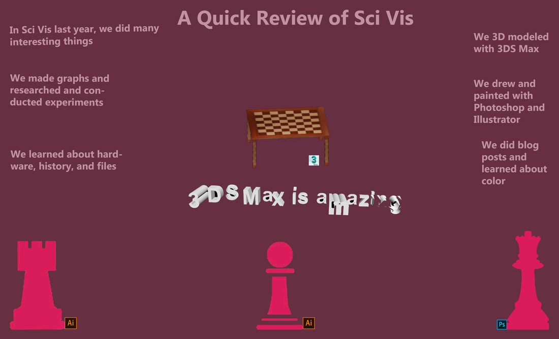 The tutorial that was most helpful for me was the create a spaceship tutorial. I messed up the first time, but then when I did everything he did, it worked out. This was the most useful because it recaps on other tools you might forget how to use. It has you do many things that you've already done, but also teaches you some other things. I learned how to use symmetry and use vertex instead of polygon to edit faces. This will help me in the future when I forget how to use symmetry or how to use inset. Even though the tutorial is long, it helps a lot.  I learned that humans are trichromats, but I don’t know what trichromats are. Apparently, no single device is capable of reproducing all visible colors. I didn’t know that the color wheel was first invented by Issac Newton. Colors come in harmonies. There are multiple color schemes. They are analogous, monochromatic, complementary, split complementary, triad, and tetradic. Tetradic is double complementary. Color matters in the world. Without color to help communicate, how would you know when to go and stop while driving. Before I took the Hartman Color Code Personality Profile survey, I picked a color from a list that appealed to me. It was blue. So when I got white, I was surprised. I made a graphic that shows how blue represents me. I then added white to it after. When I looked at results from the Hartman Color Code Personality Profile survey, I found some of them to be very painstakingly accurate. I learned that I seek independence and require kindness. I am also quiet, which I knew. Apparently when you deal with me, you have to accept and support my individuality. I am a very confident personality type. Whites like me have courage and have emotional control. I’m inexpressive and a very good listener. 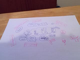 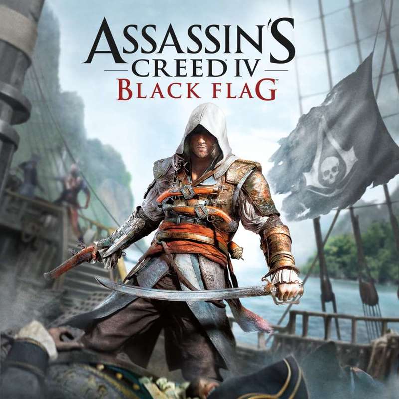 The designer of this poster clearly used emphasis. The assassin is in the middle of the image, and is clear, while the items in the background are more blurry. The assassin also has a little glow to it, the use of color makes him stand out. He uses repetition with the background items by having them not very clear. The designer used color contrast with the black and red title. The red draws you in because it stands out. I don’t know if this counts as proportion, but the A and the S are bigger than the rest of the letters in that word. Same with the B and G in BLACK FLAG. I think that the designer is trying to convey a message using these principles and design element like emphasis and contrast. I think the message is pay attention to the assassins and the background. Even if you didn’t have the title. You would be able to figure out that this was ASSASSIN'S CREED IV BLACK FLAG. The items in the background like the flag hint to the game.
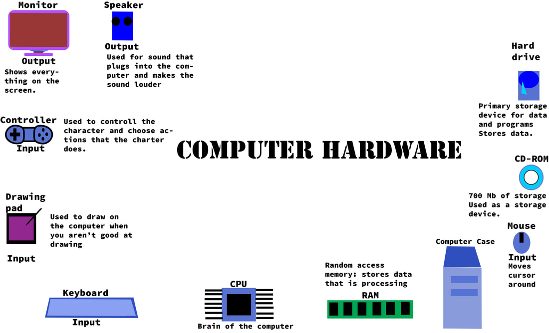
I think that it did increase my understanding. I have done things with photoshop before, but not like this. I’ve played with the effects, but not in the same way. I didn’t know that you could put outer glow on one item. What has been difficult for me would be the explaining part. I’m not very good at explaining things clearly. I think that the most impressive technique is movement and unity. The reason it impresses me is because I don’t understand it. I understand the others, but this one is very complex. It's a good technique, but hard to understand. I had some trouble with the sensor because I had an apple phone, but I got the idea. The one that I want thought was interesting was the ambient temperature sensor. The sensor detects the temperature of an object. It collects quantitative data. I might be able to use the ambient temperature sensor to find out the different temperatures of the buildings on campus. I would use a spreadsheet, so the information is easier to understand and make charts. A bar/column chart or pie chart to show the different temperatures in the different buildings. For example, for a pie chart, I might have percents of temperatures over 70 and the buildings. The bar/column chart could be the buildings and the temperatures. The info graphic below should help you understand sensors better. 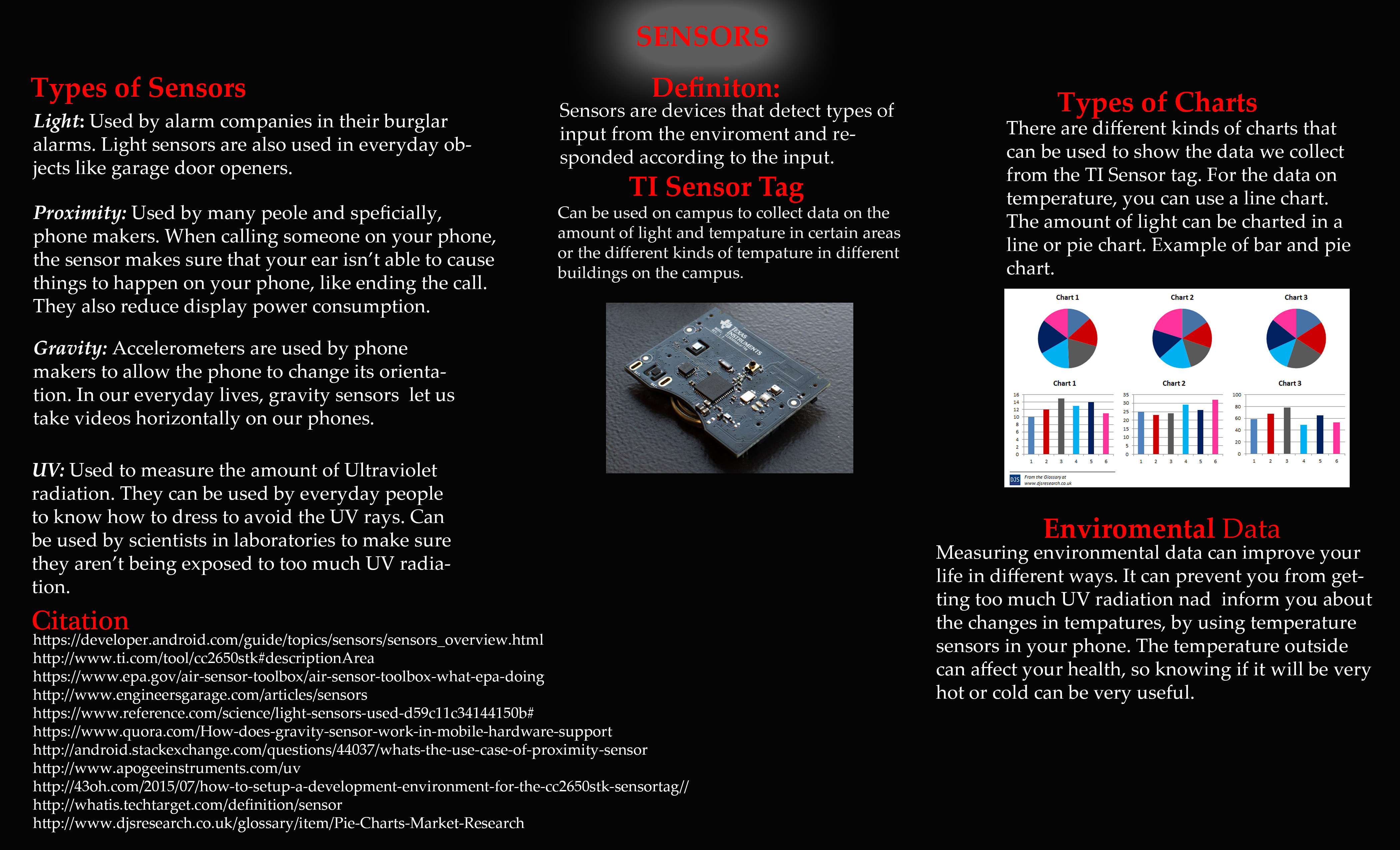 Data visualization is important to me, because it makes things easier for me to understand. I am one of those students who is partly a visual learner. If you just give me a lecture, I won't know what is going on and probably zone out. However if you give me an info graphic or a presentation with pictures, I will understand it better. I am draw to eye-catching things, so when we are doing lectures with sketch-notes in class, I understand the information.
I think that the level of awareness of world problems in students at school and around the country should be changed, by using data visualization techniques. I would make info-graphics and charts to teach student's about global issues, like climate change or poverty. Some people in our school seem very oblivious to the third world problems. Just adding charts and graphs around the school might help inform people. Something as simple as putting them on the back of bathroom doors would be step in changing the level of awareness in students at our school and around the country. Copyright law affects the artistic integrity of the game industry because it limits what you can and can’t do. If you want your game to be set in Hollywood or look like Hollywood, you might get in trouble, because the license holders of the name Hollywood might get you for copyright infringement. With the copyright law you have to get permission to use a song from some album. You legally can use 10 seconds from a 3 to 3:30 under fair use.
The protection that the copyright law provides is important, because it helps creative people not to get ripped off. The law also limits their creativity. With the law, you can’t create a version of someone else’s work. You can be inspired to make something, but it can’t be similar. I don’t think that the copyright law should be changed. The copyright law is in place so that people don’t take other people’s work and claim it to be theirs. I think that some aspects are a little extreme, but they don’t need to be changed. As you already know on Tuesday we had a guest speaker. His name is Colin Dwan from Prologue Games. He came to talk to us about his career in the game industry. He said that he didn’t really do actual game till after college. He said that he went to NC State and that has a good computer science program. He also talked about his past games like Fallen Earth. He was telling us about his newest narrative game called Knee Deep, which is in 3 acts like a play. He told us that in small companies it takes longer to create a game than bigger ones.
|